






01. Why Great Ecommerce Design Matters
Intro
Visitors often form an early impression of an ecommerce store based on its visual design, navigation, and usability — and that impression can influence whether they stay to browse or leave. A cluttered layout, a slow mobile page, or confusing navigation can cost a sale before a visitor even reaches a product page. A well-designed store, on the other hand, tends to make browsing and buying feel effortless. In this post, we're breaking down 5 ecommerce websites that get design right, then looking at how our own store, Angoer, was designed. For each one, we'll look at the typography, color choices, navigation, product presentation, and mobile experience, then pull out concrete lessons you can apply to your own store today.
02. Patagonia
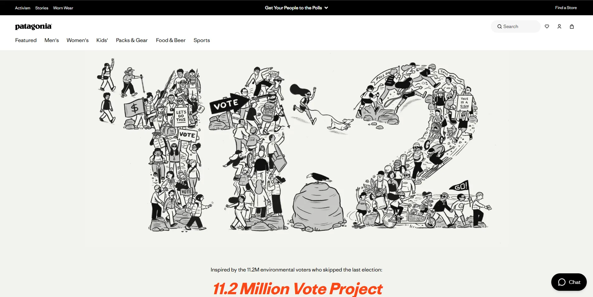
Design & Typography
Patagonia's palette is pulled directly from the outdoors — mossy greens, earthy browns, and deep, ocean-like blues — so the color choices themselves reinforce the brand's identity before a visitor reads a single word of copy. These tones stay muted rather than saturated, which keeps the focus on the product photography instead of competing with it. Navigation is handled through a clean mega-menu that expands on hover or tap, grouping a genuinely large catalog (jackets, base layers, bags, accessories, and more) into clear, labeled sections with small supporting images for key categories. This lets Patagonia surface hundreds of products without cluttering the header itself — the top bar stays minimal, and all the complexity is tucked into a dropdown that only appears when needed. It's a good example of hiding catalog depth behind a simple entry point, rather than trying to cram every category into a visible top-level menu.
Product Presentation & Mobile
Instead of relying on plain studio shots against a white background, Patagonia shows most of its gear in real-life use — people hiking, climbing, or layering up in actual weather conditions. This does double duty: it helps shoppers picture how the product performs in practice, and it reinforces the brand's outdoor, adventure-first identity in every product image, not just on marketing pages. On mobile, that same visual priority carries over rather than getting stripped out for speed. Product images stay large and full-width as you scroll, load quickly without noticeable lag, and the layout keeps enough breathing room that browsing still feels editorial rather than cramped — even on a small screen.
What we can learn
Show products in real-life use, not just plain studio shots — it helps customers picture themselves using them Build your color palette around your brand's identity and values, not short-term trends Use a mega-menu to organize large catalogs, keeping the header simple while still surfacing every category
Personal take
Patagonia’s website stands out for its clean, editorial-style design and strong visual storytelling. I especially like how it balances product discovery with inspiring outdoor content, making the experience feel more like exploring a brand than simply browsing an online store. The clear navigation, bold photography, and well-organized sections create a premium and engaging shopping experience.
03. Rains
Design & Typography
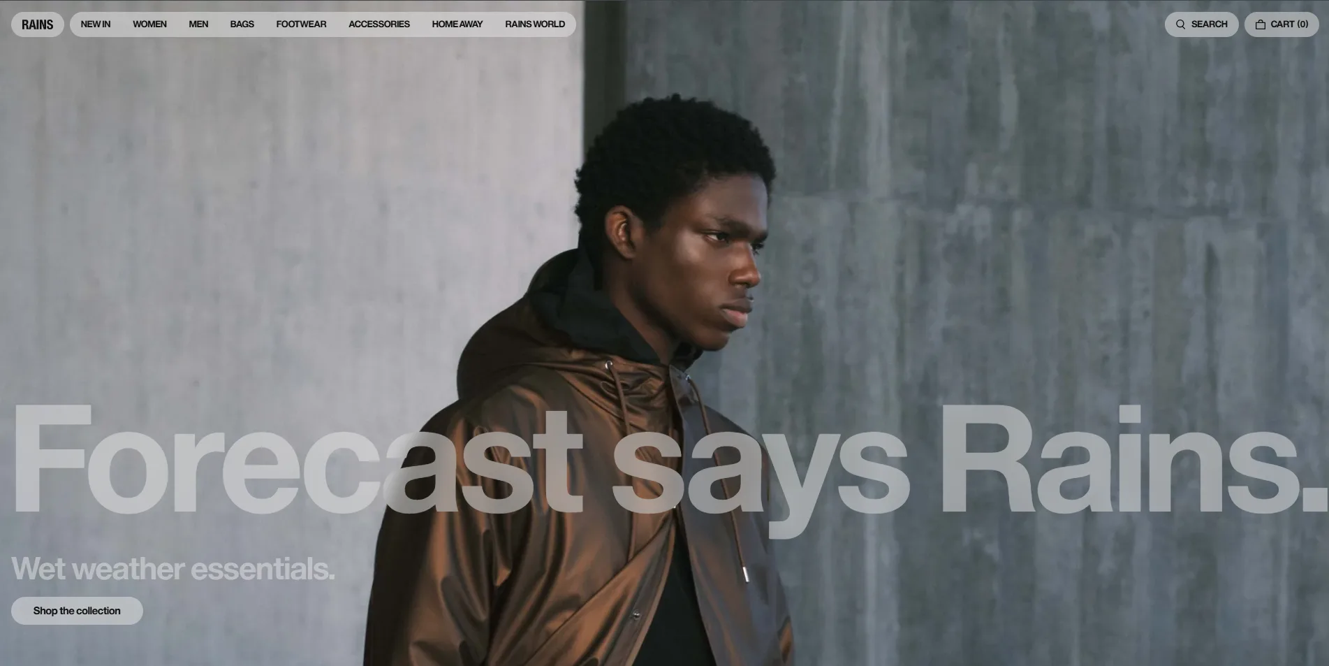
Rains takes a minimalist, restrained approach — light, understated typography paired with generous white space throughout the layout. Headlines don't shout for attention; they sit quietly above the product, letting the imagery carry the visual weight instead of the text. This "quiet by design" feel is intentional. Nothing on the page — not the type, not the color, not the layout — competes with the product itself. Every design decision seems to ask "does this help the product stand out, or distract from it?" and defaults to removing anything that isn't essential.
Colors & Navigation
Rains sticks to a strictly neutral palette — black, white, and shades of gray — so the site itself never introduces color that could clash with or distract from the product. The product's own color becomes the only accent on the page, which makes every item photo feel intentional and easy to focus on. The header stays clear and uncluttered, with just a handful of top-level links rather than a sprawling menu. On top of that, sticky call-to-action buttons — like "Shop all backpacks" or "Explore the guide" — stay visible as visitors scroll, guiding them straight to key categories instead of forcing them to go hunting through menus or scroll back to the top. It's a small detail, but it removes friction at exactly the moment a visitor is ready to act.
Product Presentation & Mobile
Menus on Rains are kept simple and collapsible by default, so they translate naturally to smaller screens instead of needing a separate mobile-only redesign. Categories tuck neatly behind a hamburger icon, and tapping through feels just as fast as the desktop mega-menu. The mobile experience overall is designed to reduce friction, with navigation and shopping interactions adapted for smaller screens rather than simply shrinking the desktop layout to fit. That distinction matters: a responsive layout that's just a smaller version of desktop can still feel like extra work on a cramped screen, while Rains' mobile-first adjustments make browsing and buying feel native to the device.
What we can learn
- Guide Visitors With Sticky CTAs — Keep key categories one tap away as visitors scroll, instead of making them hunt through menus.
- Let Neutral Colors Focus Attention — Strip out extra color from the UI so the product's own color becomes the visual focus.
- Design Mobile Checkout as Its Own Flow — Simplify mobile checkout on its own terms, not just as a shrunk-down version of desktop.
Personal take
“Rains has a beautifully minimal and modern e-commerce design. I particularly like how the site combines strong photography with simple navigation and generous whitespace, allowing the products to remain the main focus. The clear category structure and editorial-style presentation make the shopping experience feel polished and effortless.”
04. The Sill
Design & Typography
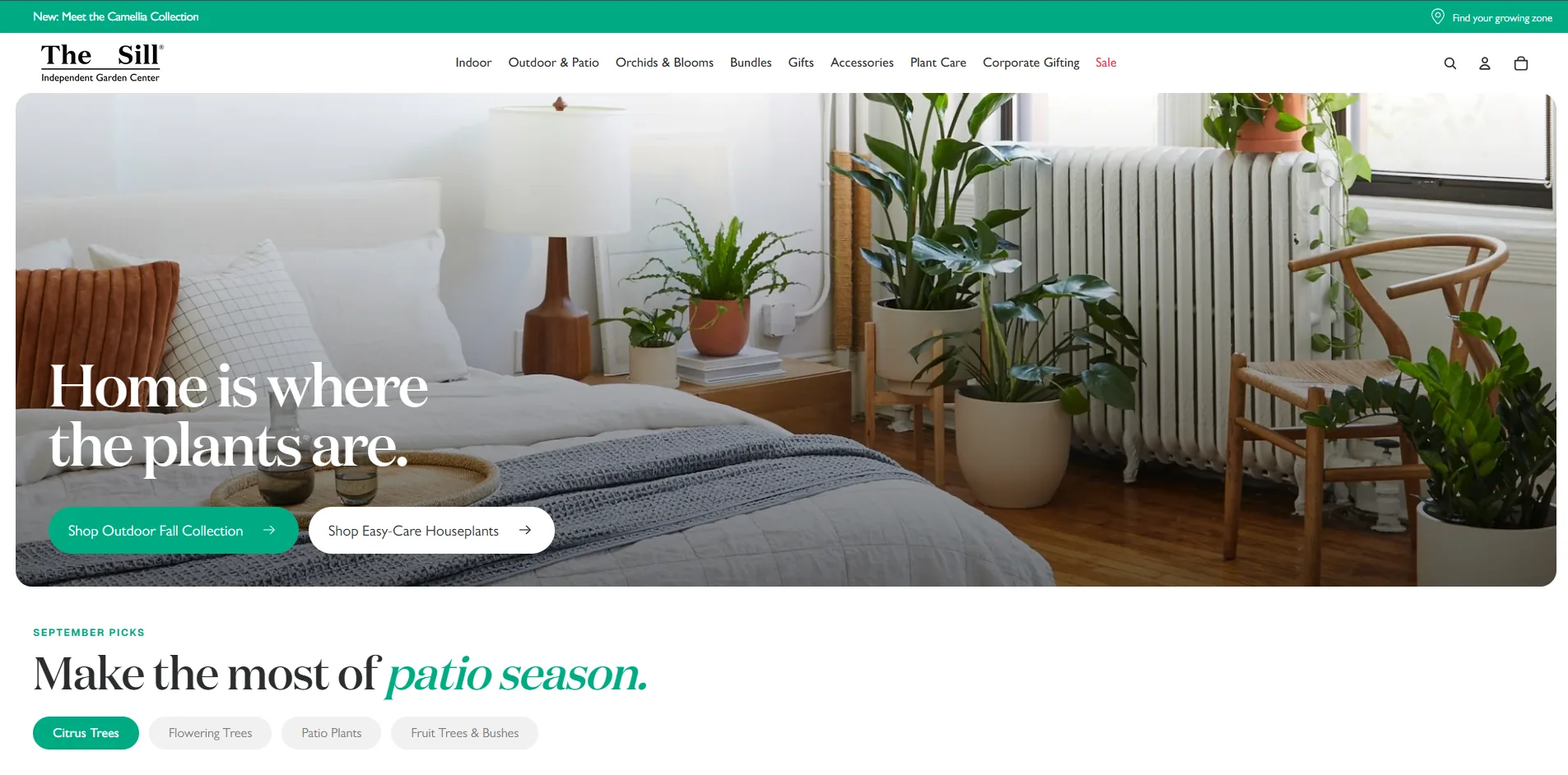
The Sill uses warm, friendly typography that fits a brand selling houseplants. The tone feels approachable rather than corporate, which matches how people shop for plants — casually, not transactionally.
Colors & Navigation
Natural, earthy tones run throughout the site, giving it a welcoming feel. The hero section is regularly refreshed with seasonal imagery and promotions, keeping the homepage feeling current rather than static.
Product Presentation & Mobile
Popular categories are surfaced right below the hero, so visitors don't have to dig for best-sellers. The responsive layout carries the same warmth and simplicity over to mobile.
What we can learn
- Match Colors to Emotional Tone — Choose a palette that reflects how customers feel about the product, not just brand guidelines.
- Refresh Hero Imagery Seasonally — Keep the homepage feeling current by rotating hero content with seasons or promotions.
- Surface Best-Sellers Early — Place popular categories right below the fold so visitors don't have to dig for them.
Personal take
“What I like most about The Sill is how naturally it blends content and commerce. The site doesn't feel like a traditional online store—it uses helpful plant-care content, clear categories, and strong product imagery to make discovering and buying plants feel effortless. The clean layout and calm visual style also keep the focus on the products.”
05. Mulberry
Design & Typography
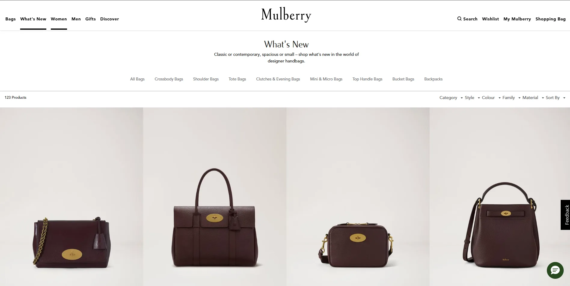
Mulberry's design speaks luxury from the first scroll. Elegant serif typography gives the site a premium, editorial feel that matches the price point of the handbags it sells.
Colors & Navigation
The palette leans rich and slightly dark, balancing elegance with clarity — the site never feels purely "functional" the way a mass-market store might. Navigation stays simple despite the premium styling, so it never sacrifices usability for looks.
Product Presentation & Mobile
Product photography focuses heavily on detail — leather texture, stitching, hardware — building the kind of trust needed for a high-ticket purchase. The same level of care carries through to the mobile experience.
What we can learn
Personal take
“What I like most about Mulberry is how the website combines luxury, heritage, and modern e-commerce without making the experience feel overwhelming. The navigation is well structured, while sections such as craftsmanship, design icons, and the brand story add depth beyond simply selling products. The strong imagery and spacious layout also give the products a refined, premium feel.”
06. Our Own Design: Angoer — A Case Study
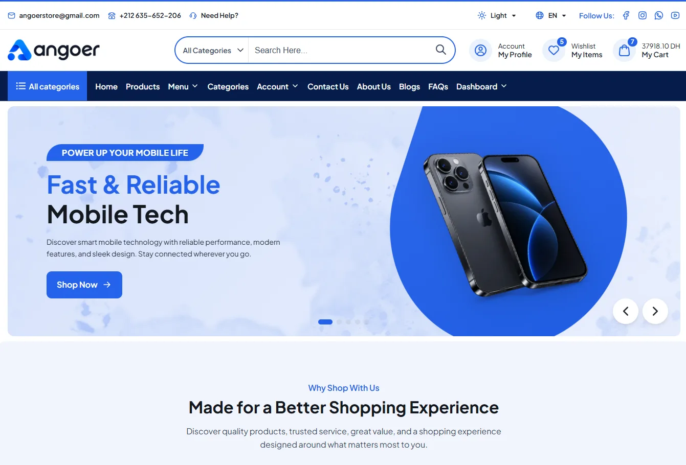
Design & Typography
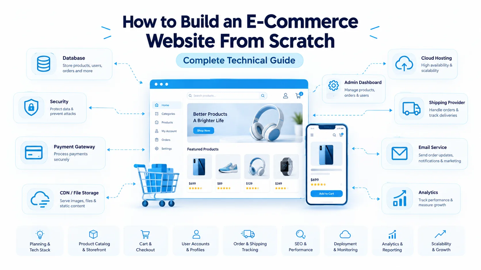
Angoer features a clean, modern e-commerce layout built around a strong blue-and-white color palette. The design uses a structured header and navigation system, a prominent search bar, and clear account, wishlist, and cart actions for easy access.
The homepage focuses on a large promotional hero section with bold typography, product-focused imagery, and a clear “Shop Now” call-to-action. Rounded corners, soft backgrounds, spacious layouts, and subtle visual elements create a polished and contemporary shopping experience while keeping the interface easy to navigate.
Colors & Navigation
Angoer uses a clean blue-and-white color palette, with vibrant blue accents for buttons, links, icons, and active elements, creating a modern and energetic visual identity. Its navigation is structured and easy to follow, combining a prominent search bar with quick-access options for the account, wishlist, and cart. A dedicated “All Categories” section provides quick access to products, while the dark navy navigation bar creates strong contrast and a clear visual hierarchy across the header.
Product Presentation & Mobile
Products are presented with clean, high-quality visuals and clear information, making them easy to explore and compare. The responsive mobile design keeps the same visual clarity while adapting the layout, navigation, and product cards smoothly to smaller screens.
What we improved / learned building it
- Improved Product Discovery — Made it easier for shoppers to browse categories and discover products quickly.
- Strengthened Visual Hierarchy — Prioritized product images, prices, offers, and calls to action for faster decision-making.
- Simplified Ecommerce Navigation — Created a clear navigation structure that helps users move naturally through the store.
- Optimized Product Presentation — Improved product cards and layouts to display essential information without visual clutter.
- Enhanced Mobile Ecommerce UX — Adapted the shopping experience for smaller screens with responsive layouts and touch-friendly elements.
- Created a More Consistent Design System — Used consistent spacing, typography, buttons, and components throughout the interface.
Personal take
“Building this website taught me how to balance modern design with usability. The biggest challenge was creating a clean shopping experience that works smoothly across desktop and mobile. I also learned how important product presentation, navigation, and visual hierarchy are in e-commerce.”
07. Conclusion
Across the five ecommerce examples above, three patterns stand out: photography does more work than copy, navigation stays simple no matter how large the catalog, and mobile isn't an afterthought — it's adapted as its own experience. Below, we look at how these same principles show up in our own store, Angoer.
Whether you're studying an established brand or reviewing your own store, the same questions apply: does your typography match your brand's tone, does your color palette support your product instead of competing with it, and does your mobile experience feel designed on its own terms — not just shrunk down from desktop?